Best Hats for Hometown Pride That Last
Share
A good hometown hat gets worn hard. It goes from the jobsite to a Friday night game, from a summer festival to a snow-covered parking lot. That is why the best hats for hometown pride are not just about a clever city reference or a trendy color. They need a solid fit, a quality base hat, and embroidery that still looks sharp after real use.
For Buffalo businesses, teams, and locals, headwear is one of the simplest ways to put local identity front and center. It is useful, visible, and easy to make your own. The difference between a hat people keep wearing and one that stays in a giveaway box usually comes down to the details.
What Makes the Best Hats for Hometown Pride
The strongest hometown hats balance local meaning with everyday wearability. A design can be proud without being loud. A clean city abbreviation, a recognizable area code, a buffalo-inspired mark, a neighborhood reference, or a team-style wordmark can all work when the design is easy to read from a few feet away.
Start with the hat itself. A low-quality cap with thin panels, weak stitching, or an uncomfortable closure will not earn repeat wear, no matter how good the logo looks. Structured trucker hats, classic snapbacks, relaxed dad caps, and knit beanies all have a place. The right choice depends on who will wear it and where.
Then consider the decoration. High-density embroidery gives a hometown design definition and texture that printed graphics cannot match. It holds up well on a cap front and gives names, logos, and short phrases a finished look. For commercial orders, it also helps keep branding consistent across staff apparel, customer gifts, and event merchandise.
Keep the Design Clear and Recognizable
A hat is a small canvas. Fine details that look good on a computer screen can disappear once they are stitched into thread. Strong hat designs use bold lettering, simple shapes, and enough spacing between elements. If a logo has a long company name, consider using a shortened mark or initials on the hat front and placing the full name on another garment.
For Buffalo-themed retail hats, less often does more. A simple Buffalo reference in a confident stitch pattern can feel more premium than an overbuilt design with too many colors and phrases competing for space. The goal is a hat someone reaches for every week, not just on game day.
Choose Colors That Work Beyond One Occasion
Black, navy, charcoal, forest green, and khaki remain reliable for a reason. They work with workwear, casual clothing, uniforms, and outerwear. A high-contrast thread color makes the embroidery easier to see, while tonal embroidery offers a more understated, professional finish.
Bright colors can make sense for a fundraiser, school event, or sports program. Just remember that a highly specific colorway may limit repeat wear. If the order is for employees or clients, neutral cap colors with clean logo embroidery usually provide the best return. If it is for a fan drop or a local festival, a bolder color can create the right energy.
Pick the Right Hat Style for the Job
There is no single best hat for every hometown project. The audience and setting should decide the style before the artwork is finalized.
Trucker Hats for Casual Visibility
Trucker hats are a natural fit for outdoor crews, breweries, event teams, car clubs, and casual local merchandise. The mesh back provides airflow, while the foam or structured front gives embroidered graphics a prominent home. They are especially effective for designs with a short name, bold icon, or patch-style layout.
The trade-off is that trucker hats have a distinct casual look. They may not be the best choice for a corporate office, financial firm, or more polished hospitality brand. For those uses, a structured twill cap can feel more appropriate.
Structured Caps for Teams and Businesses
A structured cap has a firmer front panel and a more traditional profile. It is a dependable option for company uniforms, golf outings, youth teams, contractor crews, and branded giveaways. The stable front supports detailed embroidery well, including logos with multiple elements.
This is the practical choice when you need broad appeal. A well-built structured cap can work across departments and age groups without asking people to adopt a niche style.
Relaxed Caps for an Easy Local Look
Unstructured, relaxed-fit caps have a softer crown and broken-in feel. They suit coffee shops, boutiques, creative teams, alumni groups, and hometown retail collections. A washed cotton cap with a simple embroidered Buffalo design has the kind of everyday character that makes it feel personal rather than promotional.
Because the front panel is softer, artwork should stay simple. Large, dense designs can pull or wrinkle the fabric. Small-to-medium embroidery, clean lettering, and modest thread counts are the better route.
Beanies for Cold-Weather Pride
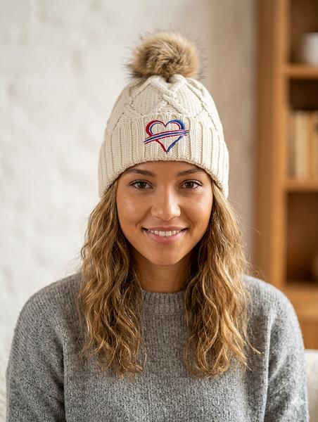
In Western New York, a beanie is not an afterthought. It is useful gear for much of the year. Cuffed knit beanies offer a strong embroidery area and work well for crews, winter events, school programs, and local retail.
A beanie design should be compact and direct. A city name, company mark, neighborhood abbreviation, or short statement can look excellent on the cuff. Avoid trying to reproduce a highly detailed illustration in a small knit space.
Embroidery Details That Separate Premium From Cheap
The quality of the embroidery matters as much as the cap. Thin stitching, poor registration, loose backing, and overly dense thread can turn a promising design into something stiff or uneven. Premium headwear should look clean from the front and finished from the inside.
Thread color needs real attention. A slightly darker blue or warmer gray can change the entire feel of a logo. For company projects, match approved brand colors as closely as the embroidery process allows. For hometown designs, choose thread combinations that maintain contrast and stay readable in natural light.
Placement matters, too. Front-center embroidery is the standard for a reason, but it is not the only option. A small side hit can add a subtle local detail. Back embroidery works well for a short phrase, location, or website-free identifier. For a higher-end look, a front embroidered patch or raised 3D stitching can add dimension, though it is best reserved for artwork designed for that treatment.
At We Sew It Buffalo, the focus is on durable embroidered headwear that looks intentional, not rushed. That means selecting cap styles that match the use case and building artwork around what stitches well, rather than forcing a screen graphic onto a hat.
Ordering Hometown Hats for a Group or Event
If you are buying for a business, team, or event, begin with the purpose. Is the hat a uniform piece, a retail item, a sponsor gift, or a one-day giveaway? A uniform cap needs consistency and comfort. A retail cap needs personality and perceived value. A giveaway needs a design people will still want to wear after the event is over.
Order quantity also affects the decision. For a larger run, choosing one versatile cap style and a limited thread palette keeps the project clean and manageable. For a smaller branded collection, you may have room to use premium details such as specialty patches, contrasting rope, or multiple cap colors.
Before production, review the artwork at actual hat size. Ask whether the smallest letters will remain readable and whether the design has enough open space. This step prevents the most common disappointment in custom headwear: a logo that was technically reproduced but does not look right when worn.
Make Local Pride Wearable
The best hometown hat does not need to explain itself. It fits well, holds up, and gives people a simple way to represent where they are from or who they support. Choose a dependable cap, keep the embroidery purposeful, and make the local reference strong enough to feel familiar without making it feel forced.
When the details are right, a hometown hat becomes more than branded gear. It becomes the one people grab on the way out the door.