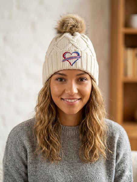
A Practical Guide to Custom Embroidered Caps
Share
A good hat gets worn because it feels like yours. That can mean a Buffalo skyline, a favorite football number, a neighborhood phrase, a business logo, or a design that gives a quick nod to home without saying too much. This guide to custom embroidered caps breaks down the choices that matter before your idea goes on a cap.
Custom embroidery is not about making a hat complicated. It is about getting the details right so the finished piece looks clean, feels comfortable, and holds up through tailgates, errands, game days, and whatever Western New York weather has planned.
Start With How the Cap Will Be Worn
Before choosing thread colors or artwork, pick the cap style around the person wearing it. A structured trucker cap has a taller front and a more classic game-day look. It gives embroidery room to stand out, especially for larger logos, bold lettering, and Buffalo-inspired graphics.
A relaxed dad hat sits softer and lower. It works well for smaller embroidery, simple text, and everyday wear. If the design is a short phrase, initials, or a clean local icon, a relaxed cap can keep it from looking overdone.
Flat-brim styles make more sense for a sharper, more modern look. They are often a better fit for larger front designs, but they are not for everybody. If the cap is a gift, think about what the recipient already wears. The best custom hat is usually not the flashiest one. It is the one that gets grabbed on the way out the door.
Color matters here, too. Black, navy, charcoal, and royal blue are easy to wear and let bright thread pop. A lighter cap can look great in spring and summer, but it shows dirt faster. For a hat meant for parking lots, backyard parties, and regular use, darker colors are usually the practical call.
Keep the Design Clear at Cap Size
A cap front is not a billboard. The embroidery area is limited, and that is why simple designs tend to look better than busy ones. A strong Buffalo outline, a buffalo silhouette, a short nickname, or a player-inspired number can read clearly from a few feet away. Tiny details often disappear once they are stitched.
If you are using a logo or artwork, avoid thin lines, miniature text, and crowded background elements. Embroidery adds texture and dimension, but thread has limits. What looks great on a phone screen may need to be simplified before it looks right on a hat.
For text, short is usually stronger. A city name, a familiar local phrase, a set of initials, or a two-word inside joke has more impact than a full sentence. Choose a font that can be read quickly. Script fonts can look sharp, but only when the lettering is large enough and not too detailed.
A custom cap should make sense at a glance. If people need to stand close and study it to figure out what it says, it is probably doing too much.
Match the Placement to the Design
The center front is the usual spot for a reason. It is visible, balanced, and works for most logos and wording. That said, placement can change the whole feel of the cap.
A small side design is a good move for initials, a year, a small Buffalo icon, or a subtle extra detail. Back embroidery works well for a name, a short phrase, or a small number above the closure. It is a nice option when you want the front to stay clean.
The left or right panel has less room and a curved surface, so save it for simple elements. Do not force a full logo onto the side just because there is open space. A cap with one strong front design often looks better than one covered in embroidery.
Choose Thread Colors That Do Not Fight Each Other
Thread color is where a good idea can either come together or get lost. High contrast is the safe choice: white or light gray thread on navy, royal blue on black, black on tan, or red against a darker neutral. These combinations are easy to read and have the kind of punch that works in a crowd.
Tone-on-tone embroidery is more subtle. Think black thread on a black cap or navy on navy. It has a clean look, but it depends on lighting and texture, so it is not ideal if you want the design noticed right away. This style is better for a low-key gift, a work cap, or somebody who wears hats every day but does not want a loud front panel.
Try not to use too many thread colors in one small design. Two or three colors can look crisp. Five or six colors can start to feel crowded unless the artwork is large and built for it. For Buffalo sports-inspired pieces, a familiar blue, red, white, and navy combination can carry plenty of local energy without copying a complicated jersey graphic.
Also consider the cap color under the thread. Light thread can show through dark fabric differently than it does on a mockup. Clean contrast and solid shapes are the most reliable choices.
Know What Embroidery Does Best
Embroidery is built for durable, textured designs. It is a great fit for logos, block lettering, monograms, symbols, simple mascots, and bold outlines. It gives a cap a finished look that printed decoration cannot quite match.
It is less suited to photo-realistic artwork, fine shading, and very small details. If your design includes a full scene, a detailed portrait, or a lot of tiny type, it may need to be adjusted. That is not a loss. Simplifying a design often makes it look more intentional on a hat.
Raised puff embroidery can add extra dimension to bold lettering or a simple icon. It has a strong look on structured caps, especially for larger front designs. The trade-off is that it is not the right choice for small text or detailed artwork. Flat embroidery is more flexible and usually the better option for designs with fine elements.
Make It Personal Without Making It Too Specific
The best custom caps feel personal, but they still need to be wearable. A person’s name, a wedding date, a team nickname, a company mark, or a Buffalo reference can all work. The question is whether the wearer will still reach for it next season.
For gifts, think about the person’s normal style. A loud red-and-blue cap may be perfect for the fan who never misses a game. A black cap with a small embroidered buffalo may be better for someone who likes hometown pride but keeps their outfits simple.
Custom caps also work well for bachelor parties, rec teams, small businesses, family trips, golf outings, and local events. In those cases, consistency matters. Use the same cap style and thread colors across the group so the hats look connected, even if each one includes a different name or number.
At We Sew It Buffalo, the best requests usually start with a clear idea and leave room for the design to be adjusted for the cap. That is how you get something that looks like a real hat people want to wear, not a graphic squeezed onto a front panel.
Before You Place a Custom Cap Order
Take one last look at spelling, dates, and numbers. A typo in embroidery is not a quick edit. Confirm the cap color, thread color, placement, and whether the design should be centered, left chest-style on the front panel, or placed on the side.
If the hat is for an event, order with enough time for the design process and shipping. Custom work takes more planning than pulling a standard cap off a shelf. That extra time is worth it when every detail is right.
A custom embroidered cap does not need to say everything. Pick the one local reference, team feeling, or personal detail that matters most, then let the thread do its job.