How to Design Custom Fan Caps That Feel Local
Share
A good fan cap should tell people where your loyalty is before you say a word. In Buffalo, that can mean a clean buffalo silhouette, a blue-and-red color combo, a familiar phrase, or a design that gives a respectful nod to the team without looking like every hat at the stadium. If you are figuring out how to design custom fan caps, start with one simple question: what should someone recognize from across the parking lot?
The best custom caps are not crowded with every possible hometown reference. They are wearable, easy to read, and personal enough that people ask where you got them. Whether you are making a one-off gift, organizing hats for a watch party, or putting together a small batch for your crew, the details matter.
Start With One Clear Fan Identity
A cap has limited space, especially on the front panel. Trying to fit a mascot, a skyline, a slogan, a player number, and three colors into one design usually creates a busy patch of thread. Pick the main idea first.
For Buffalo fans, that idea might be local pride, football energy, a favorite player-inspired reference, or a phrase only Western New Yorkers immediately get. A buffalo icon makes a strong foundation. So does a short phrase like “Buffalo Born,” a simple number, or a clean game-day message. Keep it direct. The goal is not to explain the design. The goal is for it to land right away.
Think about who will wear it, too. A hat for a die-hard fan who never misses a Sunday game can be louder than a cap meant for someone who wants to show Buffalo pride at the grocery store, at work, or on a summer trip. Both are fan caps, but they call for different designs.
Choose the Right Cap Before You Design It
The cap style changes what embroidery will look good. A structured trucker cap gives you a firm front panel for a larger, bolder design. A dad hat has a softer, more relaxed look and usually works best with smaller lettering or a simple embroidered icon. Snapbacks feel sporty and crisp, while a curved-brim cap often feels more everyday and broken-in.
Color matters just as much as the fit. A navy, royal blue, red, black, gray, or white cap gives you plenty of room to build a Buffalo-inspired look. But contrast is what makes the embroidery readable. Royal blue thread can disappear into a navy cap. Red stitching can look sharp on black but may get lost on a dark maroon fabric. White, cream, and light gray thread often give dark caps a clean pop.
Before finalizing anything, picture the hat from a few feet away. If the front design blends into the cap color, adjust either the thread or the base. A good design should not need a close-up to work.
Match the thread to the mood
Team-adjacent colors are an easy choice, but they are not the only choice. A navy cap with white embroidery feels classic and low-key. A bright blue cap with red and white details brings more game-day energy. Black with tonal charcoal embroidery gives a more understated hometown look.
If your design includes multiple thread colors, keep the palette tight. Two or three colors are often enough. More colors can add cost, make small details harder to sew cleanly, and take away from the main message.
Keep Embroidery Simple Enough to Read
Embroidery has its own rules. It is not the same as printing a graphic onto a shirt. Tiny lines, skinny letters, and detailed artwork may look good on a screen but turn into a fuzzy or crowded result in thread.
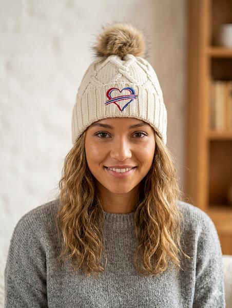
Use bold shapes and clear lettering. Script fonts can work for a short word, but they should be thick enough to stitch cleanly. Block lettering is usually the safer option for names, short sayings, numbers, and group hats. If you need to include a small detail, such as a star, bolt, heart, or snowflake, make sure it supports the design instead of competing with it.
A front design should generally have one focal point. For example, use a buffalo silhouette with a short word beneath it, or use a large number with a small local phrase on the side. Let the eye know where to look first.
Use the sides and back with purpose
The front of the cap does the heavy lifting, but side and back embroidery can make a custom piece feel finished. A small area code, initials, date, or short phrase can add meaning without packing the front panel too tightly.
This is especially useful for group orders. Put the shared design on the front, then add individual names, nicknames, or numbers on the side. For a bachelor or bachelorette weekend, a family reunion, or a Buffalo watch-party crew, that extra detail turns a standard cap into something people keep.
Just do not use every available space because it is there. A clean front with one small side detail often looks better than embroidery on all three panels.
Design Custom Fan Caps Around Real-Life Wear
Game day is only part of the picture. The hats people wear most are comfortable, easy to pair with a hoodie or tee, and not so specific that they sit in a drawer after the season ends.
Ask whether the design works with casual clothes. A simple buffalo icon on a neutral cap can go anywhere. A big championship-style slogan may be perfect for a single event, but it may not have the same everyday mileage. There is no wrong answer. It depends on whether you want a keepsake, a statement piece, or an all-season favorite.
Also consider the wearer. Adjustable snapback and strap-back caps are usually the safest choice for gifts because they fit more people. If you are ordering fitted caps, get accurate sizes first. For kids, smaller crown profiles and adjustable closures tend to make the choice easier.
Be Smart About Team References
Fans want gear that feels connected to their team. There is a difference, though, between fan-inspired design and using protected logos, official marks, or artwork without permission. When designing a custom cap, avoid copying official league or team logos unless you have the rights to use them.
You can still create something that clearly carries the spirit of Buffalo football. Use local imagery, color combinations, original buffalo artwork, player numbers where appropriate, inside jokes, game-day phrases, and hometown references. Original designs are more personal anyway. They also give your hat a look that is not sitting on a big-box store shelf.
If you are creating caps for resale, this matters even more. Keep the art original, get permission for artwork you did not create, and make sure your design does not imply official team affiliation.
Check the Artwork Before the Thread Goes Down
A quick proof review can save a lot of frustration. Look at the spelling, spacing, thread colors, and placement. Names and dates deserve an extra check. If the cap has a curved front panel, make sure straight text is not placed so low that it bends awkwardly around the crown.
It helps to request or review a digital mockup, but remember that thread has texture and thickness. Ask whether very small text will stitch clearly and whether the design needs to be simplified. A good embroidery shop will tell you when an idea needs a small adjustment to sew well.
At We Sew It Buffalo, the best custom requests usually start with a clear idea, a cap color, and a simple reference for the look you want. You do not need to be a graphic designer. You just need to know the message your hat should carry.
Make It Personal Without Making It Complicated
The strongest fan caps usually have one detail that belongs to the wearer. It could be a hometown, a nickname, a meaningful number, a wedding date, or a phrase your tailgate crew says every week. That personal touch is what separates a custom hat from generic fan gear.
Keep the main design clean, pick colors with enough contrast, and choose details that still make sense after the final whistle. A well-made Buffalo fan cap should feel right at the game, on the road, and anywhere someone spots it and says, “Go Bills.”