How to Spot Quality Embroidery on Your Cap
Share
A good Buffalo cap should look sharp from the first tailgate to the hundredth coffee run. The difference is usually in the stitching. Knowing how to spot quality embroidery helps you buy hats that keep their shape, their color, and their hometown pride instead of looking tired after a few wears.
Embroidery is more than a design sitting on fabric. It is thread, tension, backing, digitizing, and placement all working together. You do not need to be a stitch expert to judge it. A close look, a quick touch, and a little common sense will tell you plenty.
How to Spot Quality Embroidery Before You Buy
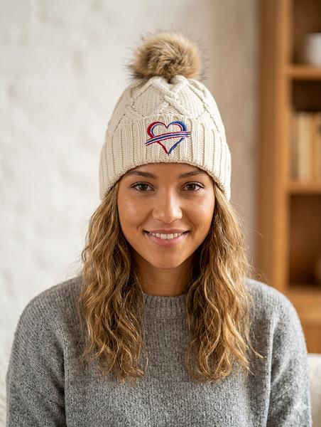
Start with the front of the design. Quality embroidery should look intentional from a normal viewing distance and hold up when you get closer. A Buffalo outline, a football-inspired graphic, or bold local lettering should be easy to read. The edges should be clean, the fills should look even, and the design should sit flat enough to look like part of the hat.
A little texture is a good thing. Embroidery is supposed to have dimension. What you do not want is thread that looks loose, fuzzy, uneven, or piled so high that the design becomes lumpy. On a cap, that kind of rough stitching can make even a great idea look cheap.
Look for clean edges and readable details
The cleanest sign of good work is a crisp outline. Curves should be smooth instead of stair-stepped. Corners should look defined, not rounded off by too much thread. If a design includes small letters, they should be readable without threads running together.
This matters most with detailed Buffalo-themed designs. A simple block word can hide minor flaws. A bison silhouette, a city shape, or a player-inspired graphic cannot. Fine points, small gaps, and narrow lines are where poor digitizing shows up fast.
Some tiny lettering will always have limits. Thread is thicker than ink, and a cap is curved, not flat like a sheet of paper. That is normal. Quality work respects those limits by simplifying tiny details when needed instead of forcing a complicated graphic into a space too small for it.
Check stitch coverage without judging by thickness alone
Dense stitching should cover the fabric cleanly. You should not see obvious gaps between thread rows or large patches of cap material peeking through where the design is meant to be solid. At the same time, more thread is not automatically better.
Overly dense embroidery can feel stiff, pucker the fabric, and distort the cap panel. A well-made design has enough coverage for rich color and clean shape, but not so much that it turns the front of the hat into a hard, bulky patch. The best embroidery feels secure while still letting the cap keep its natural form.
Run a finger lightly across the design. It should feel firm and even, with no snagging loops or thread ends catching your hand. Raised embroidery can be intentional, especially on bold lettering, but it should still look controlled.
Pay attention to thread color and finish
Good thread color is consistent across the design. Look for a full, even finish without dull spots, random shine changes, or threads that appear frayed. On darker caps, light thread should stay clean and bright. On lighter caps, dark thread should have strong definition without bleeding into the fabric.
Color choices also matter. A cap meant to show Buffalo pride does not need to match every official shade to the decimal point, but the colors should work together and read clearly from a few feet away. If the design disappears into the hat fabric, the embroidery may be technically fine but the finished cap is not doing its job.
Turn the Cap Over: The Backing Tells a Story
The underside of an embroidered panel is not always pretty, and it does not need to be. But it should look finished. Backing supports the stitches, helps prevent puckering, and keeps the design from pulling apart as the cap is worn.
Inside the hat, look for backing that is trimmed reasonably close to the design. It should cover the stitched area without hanging in long strips or leaving a tangled mess of thread. A few visible thread paths are normal. Loose knots, long uncut tails, and backing that is peeling away are not great signs.
On structured caps, backing can feel slightly firm behind the front panel. That is usually expected. On softer, unstructured hats, too much backing can make the design uncomfortable against your forehead. It depends on the hat style and where the embroidery sits. The goal is support without an awkward, scratchy feel.
Check Placement and Cap Shape
A sharp design can still look off if it is placed poorly. On the front of a cap, embroidery should be centered between the side seams and sit at a natural height above the brim. If it is noticeably tilted, crowded against the brim, or placed too high near the crown, it will stand out for the wrong reason.
Look at the hat straight on, then turn it slightly. The design should follow the curve of the front panel without warping. Letters should not stretch toward the side seams. Circular graphics should still read as circles, not ovals pulled across a curved surface.
Placement gets trickier with side embroidery, back text, and designs on mesh. Those areas can still look great, but they require the right design size. A small side hit should be clean and intentional, not oversized and crowded. On mesh trucker caps, quality work avoids stitching that bunches the mesh or makes the panel collapse.
Watch for Puckering, Pulling, and Missed Stitches
Puckering is when the fabric around the design wrinkles or draws inward. It can happen when thread tension is off, backing is not suited to the material, or the design has been made too dense for the cap. A little movement on a soft cap can be normal. Deep ripples around a logo are not.
Also scan for missed stitches. These appear as broken lines, open gaps in a filled area, or outlines that suddenly stop and restart. One tiny imperfection may not affect how much you enjoy a $22 cap. But several flaws in one small design usually point to rushed production or weak quality control.
Check the brim and crown, too. Good embroidery should not leave needle marks, pulled fabric, or dents that ruin the overall shape. The hat is the product, not just the logo on it.
What Quality Looks Like in Product Photos
Buying online means you cannot turn the cap over before checkout, so photos matter. Look for more than one angle. A clear front photo shows the design, while a side view can reveal whether it sits flat on the cap. Close-up images are especially useful for checking edge quality, thread coverage, and small details.
Be careful with heavily filtered product photos or images that only show a mockup. Mockups are helpful for seeing the idea, but they cannot prove stitch quality. Real photos should show thread texture and the actual cap material. If a brand uses the same front-facing image for every colorway, you may not be able to judge whether contrast changes from one cap to another.
Customer photos can help, but use them with some perspective. Lighting, camera focus, and how someone wears a hat can change the look. Look for repeated signs: clean lettering, consistent shape, and designs that still sit right on different heads.
For Custom Embroidery, Keep the Design Honest
Custom work is where expectations matter most. The best custom embroidery starts with a design that fits the cap and the medium. A clean name, a short phrase, a simple icon, or bold initials often stitches better than a tiny, photo-level illustration.
Before ordering, think about where the cap will be worn. A game-day hat can handle a louder front design. An everyday hat may look better with smaller front lettering or a side detail. If you are adding a memorial date, a family nickname, or a local inside joke, make sure it is large enough to read and simple enough to stitch cleanly.
At We Sew It Buffalo, the point is not to make a cap feel precious. It is to make something you will actually wear around Western New York, at the stadium, or wherever Buffalo fans show up. The strongest custom pieces are usually direct, personal, and built around a design that does not try to do too much.
Let Wear Be the Final Test
Even clean embroidery needs a decent cap underneath it. Check that the closure adjusts smoothly, the brim holds its curve, and the crown feels comfortable. A great stitched graphic on a flimsy hat is still a flimsy hat.
With normal wear, quality embroidery should stay intact. Avoid catching it on rough surfaces, and do not toss a structured cap into a hot wash. Spot-cleaning with mild soap and cool water is usually the safer move. Let it air-dry and keep the brim from getting crushed.
The cap you reach for most should not need special treatment every time it leaves the house. Pick one with clean stitches, balanced placement, and a design you would recognize from across a parking lot. That is the kind of embroidery that earns its place in the rotation.